Income Distribution Trends in the United States
This week we take a look at income distribution trends in the United
States.
Before we start, we should make clear what an income percentile is:
Percentiles divide the data into 100 equal groups.
So for example if we say that a person is on the 75th income percentile
(75th%), what it means is that if we gather 100 people from the general
population inside a room, 75 of those will have a lower income than that
person, while the other 25 of them will have a greater income.
There has been much talk lately about income inequality and the top 1% but
just how far has the working class been left behind by the current economic
status quo?
According to research
from RAND.org, if workers below the top 10% of the income distribution, had
grown at the same rate as the overall economy since 1975, they would have
collectively earned $2.5 trillion more in 2018, 67% higher than their actual
2018 earnings.
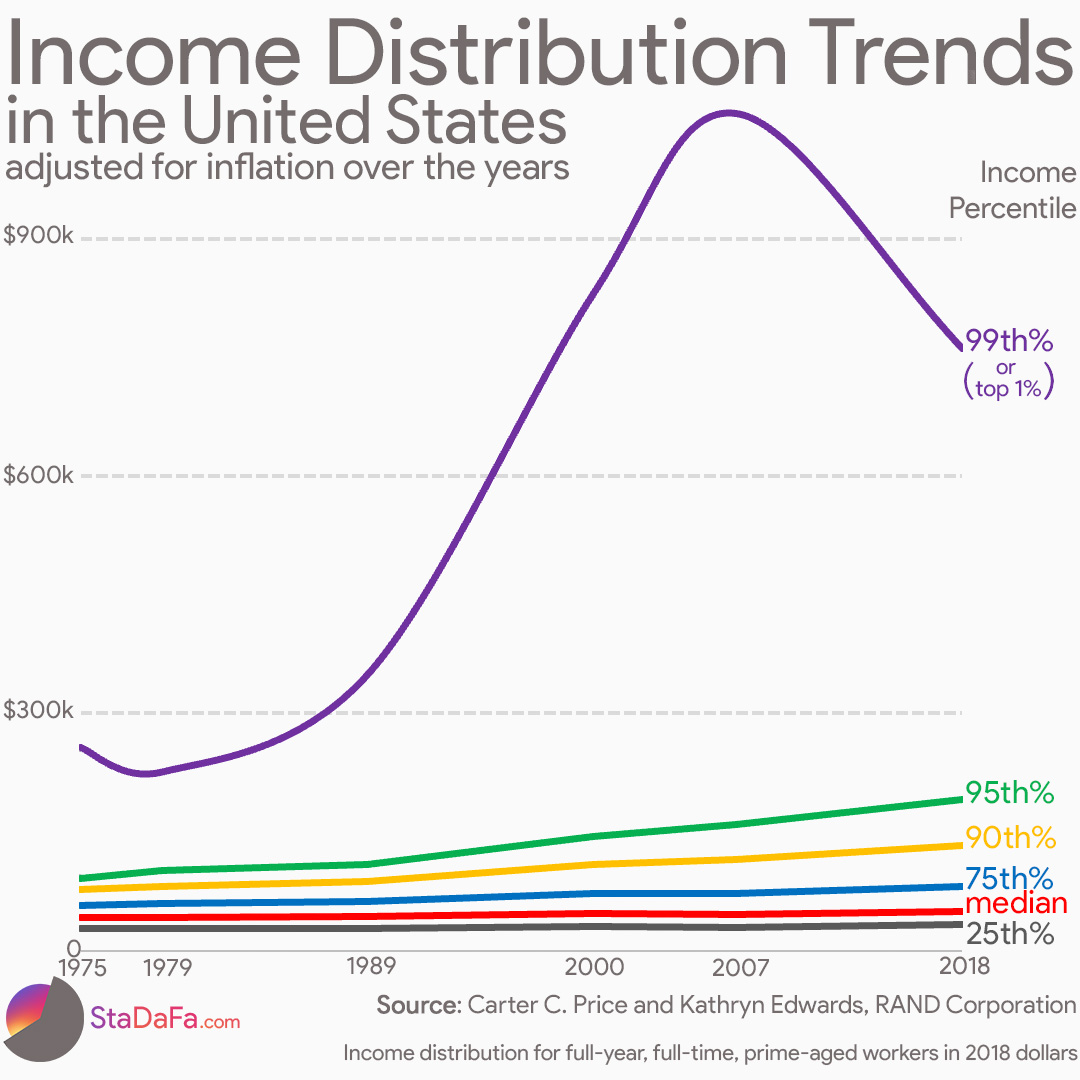
The income of workers at the 25th percentile in 1975 was $28,000 per year. The
economic growth rate would have led to income for this group being $61,000 in
2018, but it actually rose to only $33,000. Thus, instead of rising at the
economic growth rate of around 120%, these workers' incomes rose about
18%.
Among the researchers' findings is that the only group of workers for which
gains exceeded the economic growth rate was the group near the 99th
percentile (top 1%) of the income distribution.
The actual income of workers at the 99th percentile, should have risen from
$257,000 in 1975, to $560,000 by 2018 at the economic growth rate, but
it actually rose to $761,000 (and was more than $1 million in 2007)
The average person within this top 1%, which includes around 2.5 million
individuals in the United States, should have seen his or her income rise from
an average of $289,000 to $630,000 between 1975 and 2018 at the economic
growth rate. But, instead, these workers' actual average income in 2018 was
$1,384,000, more than 300% of the economic growth rate.


Comments
Post a Comment